


Bold Color Palettes in Fashion Photography 2026: Trends & Techniques
Introduction: The Power of Bold Color in 2026 Fashion Photography
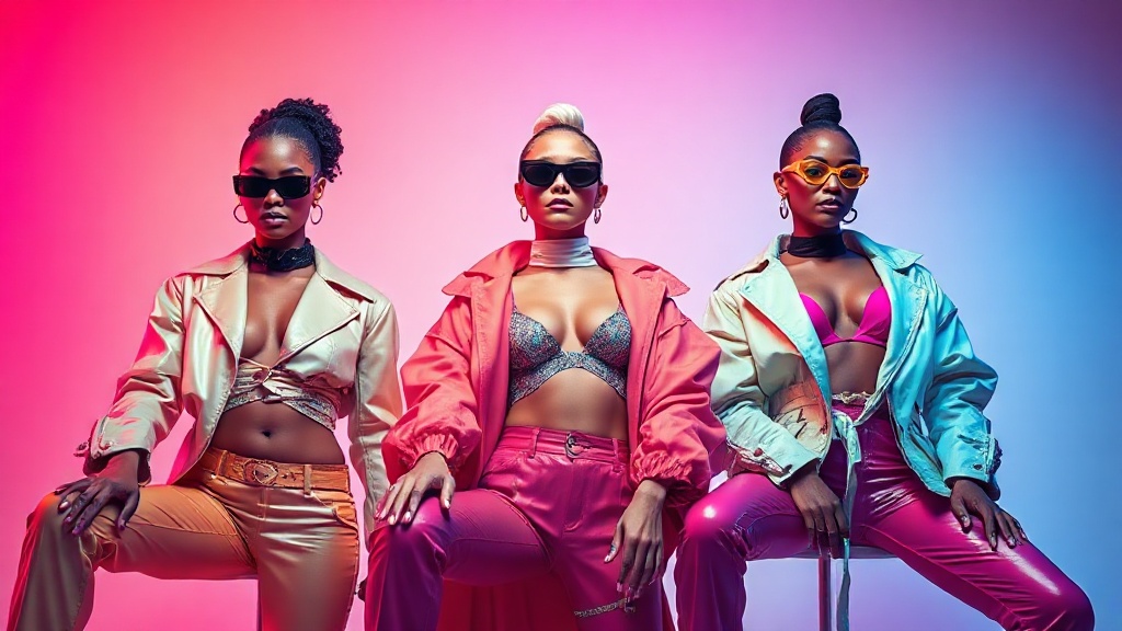
Step into any major fashion capital in 2026 and you’ll notice something unmistakable: bold color palettes in fashion photography 2026 are everywhere. These vibrant hues aren’t just an aesthetic choice—they’re rewriting the rules of visual storytelling. Brands, from high-street labels to couture houses, are harnessing the magnetic pull of saturated reds, electric blues, and vivid greens to stand out in a saturated digital landscape. Why? Because color isn’t just decoration; it’s identity. When a campaign launches with a daring splash of color, it doesn’t whisper. It shouts.
There’s a science behind the spectacle. Studies show that humans process color before shape or text; our brains are hardwired to notice what’s bright and different. In 2026, fashion photography is leveraging this instinct, transforming bold color palettes into a language that communicates emotion, attitude, and aspiration instantly. It’s not just about catching the eye, but about holding the gaze and telling a story that lingers. Brands know that in a world of endless scrolling, a flash of neon or a meticulously chosen color gradient can mean the difference between being remembered and being ignored.
The impact of these palettes ripples beyond the screen or the glossy page. They become part of a brand’s signature—think of Valentino’s Pink PP or Bottega Veneta’s parakeet green in previous seasons. Today, the stakes are even higher. With so many voices clamoring for attention, brands are betting big on bold, intentional color to create a sense of excitement, drive engagement, and foster fierce loyalty among audiences who crave authenticity and energy in equal measure.
2026 Fashion Photography Trends: Embracing Vibrant Hues
What’s hot in 2026? Neon reigns supreme, but not in the garish, overexposed way of the early 2010s. Instead, fashion photography this year is embracing futuristic color palettes—think iridescent violets, hyperreal cyans, and saturated oranges that look straight out of a sci-fi dreamscape. These colors aren’t just plucked from the ether; they reflect a cultural moment obsessed with innovation, digital frontiers, and the blending of the virtual with the tangible.
This shift is more than skin deep. The resurgence of bold color is fueled by a new consumer mindset. Gen Z and Alpha, digital natives to their core, have little patience for the washed-out minimalism of past decades. They want punchy, unapologetic visuals that echo their optimism, activism, and global perspective. In response, designers and photographers are pushing the envelope, creating images that feel both avant-garde and irresistible.
Look at the runways of Paris or the sprawling billboards in Seoul: everywhere, there’s a playfulness and confidence in color. Even classic neutrals are getting a technicolor twist—taupe with a neon trim, or beige paired with acid green accessories. The old rules are out. The new rule? If it pops, it plays.
Brands like Versace, known for their fearless approach, have doubled down on color-drenched campaigns. Editorials shot for magazines like Dazed and i-D showcase models bathed in electric pinks or framed by glowing teal backdrops. In 2026, to be on trend is to be unafraid of color’s full power.
Mastering Color Selection: Using HSL Panels for Precision
The secret weapon in every top fashion photographer’s toolkit this year? The HSL (Hue, Saturation, Lightness) panel. With digital photography now setting the gold standard, precision is everything. The HSL panel offers a granular level of control, letting photographers tweak every aspect of their bold color palettes in fashion photography 2026, from the subtlest shift in hue to the perfect level of saturation.
Imagine you’ve captured a dramatic shot with a model draped in cobalt blue silk. In post-production, you want that blue to sing without overwhelming the skin tones or clashing with a neon orange backdrop. With the HSL panel, you dial in the exact shade, push the saturation to just the right degree, and lift the brightness to make it pop. This isn’t about filters or one-click presets—it’s about crafting an image where every color carries intent and meaning.
Consistency is another reason HSL panels are indispensable. Campaigns run across platforms—print, web, massive outdoor screens. Each medium handles color differently. By making precise HSL adjustments, photographers ensure that the vibrant green on a model’s dress looks just as punchy on Instagram as it does in a Times Square billboard. No muddy tones, no surprises—just pure, controlled impact.
Mastering the HSL panel is both art and science. It’s the difference between a good shot and a showstopper. In a year obsessed with color, it’s a skill every serious fashion photographer needs in their back pocket.
Lighting Techniques to Amplify Bold Colors
Lighting can make or break a color story. In 2026, the pros know that bold color palettes demand equally bold lighting strategies. It’s not enough to rely on standard studio strobes. Instead, photographers are pushing boundaries with advanced setups that sculpt, intensify, and sometimes even invent new shades on set.
One key technique: mixing artificial and natural light. Picture a high-fashion editorial shot at golden hour, where a strobe with a magenta gel is synced with the sun’s natural warmth. The result? Raspberries and golds that glow from within, rather than looking flat or forced. Gels, reflectors, and colored LEDs are now standard issue, allowing photographers to paint with light as deftly as any digital brush.
Modifiers matter, too. Softboxes with colored grids, bare bulbs for hard-edged shadows, or bounced light for subtle gradients—all of these tools can amplify or soften bold colors as needed. The trick is knowing when to push and when to pull back. Go too hard on the saturation and you risk cartoonish exaggeration; go too soft and you lose the drama that makes bold color palettes in fashion photography 2026 so compelling.
Lighting isn’t just technical. It’s creative direction in real time. Every adjustment shapes the mood, energy, and even the narrative of the shoot. For the photographer aiming to create unforgettable color-driven images, lighting is an art form all its own.
Creative Direction: Planning a Photoshoot with Bold Color Palettes
Every jaw-dropping fashion campaign starts long before the shutter clicks. When bold color is at the heart of your vision, planning becomes both a challenge and an adventure. The process kicks off with a moodboard—a visual map of your color ambitions. Think rich Pantone swatches, references from runway shows, and even abstract art that evokes the vibe you’re chasing.
Wardrobe selection is the next frontier. It’s not just about picking dresses in hot pink or chartreuse. It’s about curating textures and fabrics that play well with color—vinyl for high-shine impact, matte jersey for saturated, flat hues, or translucent chiffon for layered color depth. Accessories become accents, adding pops of unexpected color that pull the viewer’s eye through the frame.
Set design is where the magic happens. Painted backdrops, colored props, and even digital projections are now par for the course. For a campaign inspired by cyberpunk aesthetics, you might build a set of mirrored panels lit by shifting LEDs. For a retro-futurist vibe, maybe you paint the floor electric blue and fill the space with sculptural orange shapes. Every element supports the story your colors are telling.
Styling is the glue holding it all together. A sharp stylist will find ways to echo or contrast the color palette in hair, makeup, and even nail art. The most successful shoots are symphonies—every department tuned to the same electric frequency, every image a feast for the senses.
Brand Storytelling: How Bold Colors Elevate Fashion Campaigns
The proof is in the campaigns. Luxury brands like Gucci and Balenciaga have turned to bold color palettes in fashion photography 2026 to make their latest releases unforgettable. Take Gucci’s spring campaign: models posed against turquoise backdrops, dressed in clashing corals and lemon yellows, each image a masterclass in controlled chaos. The result? Social media lit up, engagement rates soared, and the campaign became a talking point far beyond fashion circles.
Editorial powerhouses are in on the action, too. Vogue Italia’s September issue, for instance, featured a 12-page spread shot entirely in monochromatic neons. Not only did it break the mold, but it also became the magazine’s most shared story of the year. When brands use color strategically, they’re not just selling clothes—they’re selling a world, an attitude, a feeling.
Why does this approach work? Because bold color is memorable. It carves out space in the viewer’s mind, making campaigns stick long after the first glance. Brands that embrace vibrant hues report higher recall rates, stronger brand association, and, let’s be blunt—better sales numbers. In the battle for consumer attention, color is both shield and sword.
From indie designers to global powerhouses, the lesson is clear: if you want your story told—and retold—bet on bold color. It’s not just a trend. It’s the new language of fashion photography.
Conclusion: Bold Color as the Future of Fashion Photography
So where does this leave us? In 2026, bold color palettes in fashion photography 2026 are more than a fleeting fad; they’re a paradigm shift. Photographers and brands willing to embrace vibrant, intentional hues are setting the pace, capturing not just attention, but imagination. The tools and techniques—HSL panels, smart lighting, creative direction—are all in service of one goal: unforgettable images that pulse with life.
If you’re a creator or brand still clinging to muted minimalism, consider this your wake-up call. The future is bright—sometimes blindingly so. Those bold enough to color outside the lines will shape what fashion looks and feels like for years to come. Ready to make your mark? Grab your palette, step into the light, and let color do the talking.
Frequently Asked Questions
What are the main bold color palette trends in fashion photography for 2026?
In 2026, fashion photography is embracing vibrant neons, saturated jewel tones, and unexpected color combinations. These bold palettes aim to create striking visual impact and convey confidence and individuality.
How can photographers effectively use bold colors without overwhelming the subject?
Photographers can balance bold colors by using them as accents or backgrounds, while keeping the subject’s styling more neutral. Strategic lighting and thoughtful composition help ensure the subject remains the focal point.
What techniques are recommended for achieving bold color effects in post-production?
Selective color grading, contrast adjustments, and using color overlays are popular techniques. Consistent calibration across devices and careful masking ensure colors remain vibrant yet natural.
Why are bold color palettes becoming more popular in 2026 fashion photography?
Bold color palettes reflect a cultural shift toward self-expression and optimism. They help brands and photographers stand out in a crowded digital landscape, capturing attention and conveying strong visual messages.
How do bold color palettes influence the mood and storytelling in fashion photography?
Bold colors can evoke emotions such as excitement, empowerment, or playfulness. They enhance storytelling by setting a distinct tone, making images more memorable and engaging to viewers.


